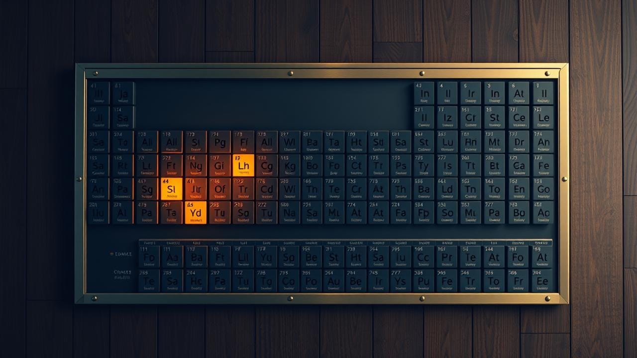
The periodic table as the most underused design tool
Most teams design types ad-hoc and apologize for the shape later. The periodic-table layout, an ordering property, vertical families, horizontal periods, turns type design into a discipline that lets you see the missing types before you build the wrong ones.

The way most teams design a type system is: they build Type A because they need it. A month later they need Type B, so they build it. A month after that someone notices Type B is really a variant of A (same fields, different defaults, slightly different lifecycle) and now there's a refactor on the table that nobody wants to do, because the codebase has already grown around the assumption that A and B are unrelated. By the time C, D, and E land, the relationships are obvious to anyone reading the code, but the code itself is shaped against them. You spend the next year apologizing for it in PR comments.
I keep coming back to the periodic table as the metaphor that fixes this. Not because chemistry has anything to teach a type designer, but because Mendeleev's layout is the cleanest known example of someone arranging a set of types so that the arrangement itself does the work. He didn't invent the elements. He arranged them (by an ordering property, into vertical families, with horizontal trends) and the arrangement made the gaps visible. He could point at a hole in the grid and say "there is an element here, it weighs about this much, it behaves about like this," and a few decades later somebody dug up gallium and germanium and the predictions were right.
That's the move I want from a type system. Not "we have a list of types." A grid where the layout itself tells you which types exist, which types are missing, and which types you've accidentally built twice in different rows.
What the metaphor actually demands
Three pieces of structure in the periodic table aren't decoration. They're the load-bearing parts.
An ordering property. Mendeleev started with atomic weight; we now use atomic number. The point is not which property, the point is that there's one monotonic axis that puts the elements in a defensible left-to-right order. Without that, the rest of the structure doesn't form. You need the equivalent for your types: the single property that, when you sort by it, makes the families fall out of the arrangement instead of being imposed on it.
Vertical families. Elements in the same column share behavior because they share the property that drives the behavior. The family is not "we put them in the same column because they look similar." The family is "they share a structural property, and the column is how we made it visible." Same constraint for types: a family is a set of types that share a structural feature, and that shared feature is what gives them shared behavior.
Horizontal periods. As you move across a row, the properties trend in a predictable way. The period isn't a category. It's a gradient. For types, the analog is: as you move across a row, something is monotonically changing, and the change predicts how each type in the row is going to behave.
An axis, families, periods. If you can find the equivalent for your types, the layout starts doing the work. If you can't, you don't have a periodic table, you have a list with categories penciled in afterwards.
A worked example: a content type system
Take a content type system for some internal tool that surfaces "things", articles, comments, pull requests, incidents, runbooks, dashboards, alerts, postmortems, ADRs. A recognizable mess. Most teams ship it as ten unrelated classes and a switch statement that grows a new branch every quarter.
The ad-hoc design produces ten types in a flat list. Each has its own fields, permissions model, notification rules, retention policy. Six months later, when somebody asks "should comments and PR reviews share a permission model?", the answer is "they should have, but we didn't, and now they don't."
The periodic-table design starts by asking what the ordering property is. The one I usually find works is durability, how long the artifact is meant to last, how immutable once written. On the left, the most ephemeral, append-only things (alerts, log lines, events). On the right, the most durable, versioned, deliberate artifacts (ADRs, postmortems, runbooks). In the middle, the messier stuff that has some durability but gets edited and rotted.
That ordering suggests the periods. As you move from ephemeral to durable, editability decreases, review weight increases, retention grows, audit obligations come on. Write that down as a row trend and check each type against it. If a type breaks the trend, an "alert" that gets edited regularly and treated as the oncall handoff source of truth, you've found a misclassification, and probably a bug in how the team is using the type.
Then the families. A family I keep finding useful is attribution shape: who authors, edits, owns it. Single-author-immutable is one (events, alerts). Multi-author-collaborative is another (PR reviews, incident timelines). Single-author-with-formal-reviewers is a third (ADRs, postmortems). Each family inherits a permission model, notification model, versioning model, not from the type, but from the family. The family does the work; the type inherits.
Once you've laid the grid out, the gaps light up. You notice you have three durable types with single-author-with-reviewers attribution but nothing in the ephemeral column with that shape. Should there be? Maybe the team needs a "reviewed alert" that requires sign-off before it fires. Maybe not, maybe that cell is genuinely empty. Either way, the question exists now. Without the grid, you'd just keep shipping types into the flat list.
Where I keep finding it
The same structure shows up everywhere I've worked once you start looking for it.
vRA blueprints had a periodic-table problem nobody framed that way: dozens of blueprints accumulated over years, each authored by whoever needed it that week, with no shared structural axis. Inevitably you'd find three blueprints that were really the same shape with different defaults, and four more that were structurally different in ways that mattered but were named identically. A periodic-table layout, order by workload class, family by attribution-and-ownership shape, period by environment progression, would have caught most of it before the catalog hit a hundred entries. (Some of it I caught with a property-set lineage that played a similar role; most of it, after the fact.)
Kubernetes CRDs are a clean case because the family structure is forced on you: Workload, Workload-Adjacent, Networking, Storage, Policy. You can pretend your CRD doesn't belong to a family, but the operator pattern, the reconciliation loop, the status conventions will betray which family you're really in. Teams that design their CRDs by first deciding which family they're joining ship CRDs that compose. Teams that discover the family later end up with operators that all reinvent the same patterns slightly differently.
API resource hierarchies are the one I think about most. Every REST API I've shipped had an implicit periodic table, some resources are containers, some are leaves, some are events, some are policies, and almost none of them had the layout written down. The ones where the team did write it down ended up with predictable URLs, verbs, and error shapes. The ones where the team didn't ended up with the API equivalent of "iron in the noble-gas column": a resource nominally in one family but behaving like another, surprising every consumer.
AI tool taxonomies are the most recent place I've watched this play out. Tools the model can call, search, retrieval, code execution, file operations, scheduling, communication, payment, get added one at a time, by whoever needed them, and end up as a flat list of forty things with overlapping responsibilities. Lay them out as a grid (order by side effect strength, family by what kind of object they touch, period by reversibility) and the duplicates jump out, the missing tools jump out, the ones that should have been merged jump out. The model also reasons about them more cleanly when the grid is exposed instead of the flat list, but that's almost a side benefit; the main payoff is for the humans designing the toolset.
The link to the rest of the work
The periodic table isn't a replacement for the atoms-and-molecules pattern. It's the layout you use to figure out what your atoms are in the first place. Atoms compose into molecules cleanly when the atoms are well-designed; the periodic-table layout is what tells you whether your atoms are well-designed before you start building molecules out of them. Get the grid right and the composition rules become legible, atoms in the same family compose with the same molecule shapes, atoms in adjacent periods substitute for each other in predictable ways. Get the grid wrong and your molecules end up doing weird things because the underlying atoms were never properly classified.
The connection to decisions as code is similar. The decisions surfaced at the boundary of a self-service system are a typed set, and the same discipline applies. Ordering property: often scope of impact. Families: often classification, sizing, ownership, environment. Trend across a row: as scope grows, approval weight grows, change-velocity drops, audit footprint widens. Lay them out and you can see whether your decision surface is symmetric, whether you've exposed the same kind of decision in every category where it should exist, instead of the lopsided pattern you get when each decision was added as someone happened to need it.
The discipline, not the chart
The chart is not the point. The point is the discipline of arranging types by their relationships before you ship them, so the arrangement reveals what's missing. Drawing a literal grid is sometimes useful and sometimes overkill; what matters is that someone identified the ordering property, the families, and the trends, and wrote that down where the next person designing a type can read it. If they can read it, they'll add new types into the right cells. If they can't, they'll add new types to the bottom of the list, and a year from now somebody else will be writing the apology.
The reason I call this the most underused design tool is that the cost is small and the payoff is large, and almost no team I've watched has done it. The cost is a couple of hours, early, with the right people in the room. The payoff is a type system that scales without the periodic refactor that nobody wants to do.
You don't need the chemistry. You need the layout discipline. The metaphor is just the most legible existing example of someone applying that discipline and getting the gaps to light up. Borrow the discipline; the chemistry takes care of itself.
, Sid