

The customer view vs the consultant view: two surfaces, one product
One backend, two surfaces. Customer asks and gets an answer. Consultant supervises the queue, approves, denies, and mines for patterns.

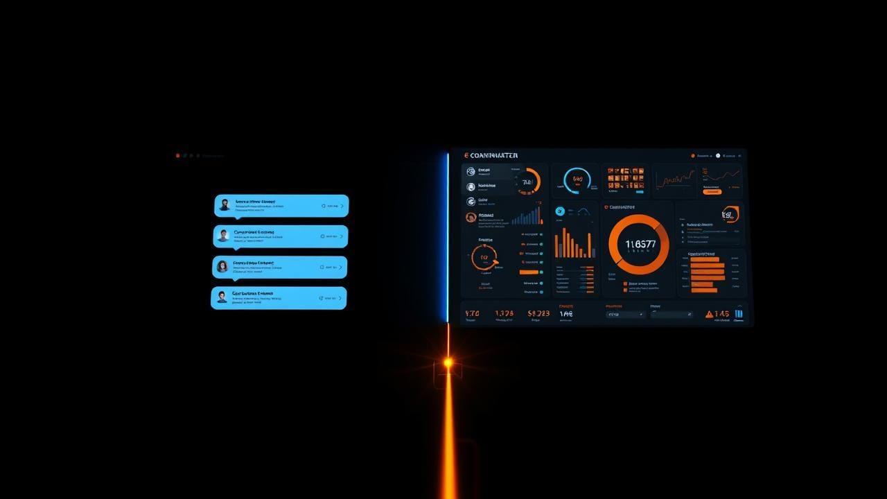
Last week I wrote about getting a new consultant from signup to a working surface in five minutes. That assumes one thing the new consultant doesn't always realize on day one: they're not just a user. They're a supervisor of their own AI.
Which means this product has two faces. Two UIs sitting on the same backend, showing different things, optimized for different work, measured by different numbers.
I want to talk about that split because I see people get it wrong in the same way every time. They build one surface (the customer-facing chat) and then bolt on a "settings page" or "admin panel" later for the consultant. The consultant view ends up being a forms-and-tables afterthought that nobody enjoys using. So the consultant doesn't use it. So the system doesn't learn. So the product stays stuck in human-approve-everything mode forever.
The fix is to treat the consultant view as a real product surface from day one. Not "admin." A product. The other half of what you're selling.
What each surface is actually for
Let me ground it before going technical.
The customer view is the front of the house. A small business owner needs help with a hiring decision and they're paying an HR consultant whose surface is built on this product. They open the app, type "I have two finalists for a senior PM role. Here's their backgrounds. Here's the role, what would you push on in the next round?" and they want an answer. Maybe right now, maybe in 20 minutes. They don't care which.
The consultant view is the back of the house. The HR consultant whose name is on the product opens it Monday morning and sees: 23 queries from customers since Friday. 18 have been auto-resolved (the AI handled it confidently, the answer went out, all logged). 4 are in their approval queue (the AI drafted an answer, low-medium confidence, the consultant has to sign off). 1 is escalated (the AI tagged it as outside-rubric, hand-it-to-the-human). The consultant works that queue, approves what's good, edits what's almost-good, denies what's wrong, and reads the auto-resolved trail for quality control.
Two surfaces. Same data underneath. Different jobs.
What the customer view actually shows
Plain shape: ask a question, get an answer. Or get a "we're working on it" status if the answer is queued for review.
That's it. Everything else on the customer side is decoration.
The trap I see people fall into: trying to make the customer view "smart." Showing confidence scores. Surfacing which retrieved documents got used. Letting the customer pick a model. None of this. The customer pays for the consultant's expertise delivered through software. They don't want to look at the engine room.
What the customer view does need:
- A question box that handles the obvious things, markdown, file attach, voice input optional.
- A clear "answer pending review" state for queued items, with an honest estimate of when they'll see something. Not "soon." A real time band.
- A history of their own past queries so they can scroll back and reference prior answers.
- A graceful state when something falls outside what the AI can handle, with the human-only fallback the consultant chose (see the failure-modes piece, #14, for what that looks like).
- And, optionally, the ability to mark an answer as "this didn't help" so the consultant sees the miss.
That's the surface. Clean. Calm. A typing box and a panel of answers. The work is invisible.
The behind-the-scenes path is the three-loop pattern from piece #9: triage routes the query, diagnose runs the retrieval-augmented generation (that's RAG (pulling the consultant's relevant material into the prompt) if you want to read up later), resolve either ships the answer straight to the customer or hands it to the approval queue. The customer view doesn't show any of that. It shows "thinking..." and then "here's your answer" or "this is queued, expect ~15 minutes."
What the consultant view actually shows
This is the surface I underestimate every time I sketch a new product and then regret.
The consultant view is a working tool. It has to feel good to use because the consultant will be in it five days a week. Six panels, roughly:
The queue. A list of pending items. Customer query at the top, the AI's drafted answer in the middle, the retrieved sources (with hover or click to see the actual cited content), the confidence signal, and three buttons: approve, edit-and-approve, deny. Edit-and-approve is by far the most-used. The deny is a learning signal, denied items pattern-mine into future eval cases.
Resolved history. Everything the AI auto-resolved (didn't need human approval) shown in a scrollable feed. The consultant skims it. They're spot-checking. If they see something off, they click in and reclassify it back into the approval gate retroactively, which both fixes the customer-facing record (with audit) and feeds back into the confidence threshold.
Pattern view. The interesting one. A view that clusters customer queries by topic or intent over time and shows which clusters the AI handles well (high confidence, low edit rate, no complaints) and which it doesn't (low confidence, high edit rate, denials). This is where the consultant decides what to add training material on next. "Oh, every query about offer-stage negotiation is getting edited. I should drop in my offer-stage playbook."
Persona controls. The voice-shaping settings from onboarding (see last week's piece) plus the ability to tune them as they learn. Tone, length, hedge level, the specifics of how their AI should and shouldn't talk to customers. Plus an upload-more-content path that drops new material into the retrieval store.
Approval-gate thresholds. The actual knob from piece #12. On day one, this is set so everything goes to the queue. As the consultant builds confidence in certain query classes (and the data backs it up) they can let those classes auto-resolve. The view shows the current threshold per class and the suggested-by-data threshold, side by side.
Audit trail. Every decision, who made it (AI or human), what evidence it used, when. Searchable. (See piece #13 for the audit-on-day-one argument; this is the surface where that audit becomes useful instead of just compliant.)
Want to go deeper on the gate mechanics? The threshold logic and how it moves over time is in The approve-deny gate and when it goes away. The view I'm describing here is the surface that makes that mechanism tractable for a human.
Three consultants, three surfaces, same backend
A product PM offering decision-coaching as a service. Customer side: a junior PM at a Series A startup types in "Should we ship the feature now or after we redo the onboarding?" and gets back a structured analysis using the PM's framework, citing two of the PM's past write-ups. Approval queue side: the PM whose name is on the product reviews 6-8 of these a day during launch, approves most, edits a couple, denies one. Pattern view tells them this week's recurring miss is around technical-debt trade-offs, they upload a new write-up on that. The customer never sees any of this.
A medical specialist doing second-opinion review. Customer side: a patient (or a primary-care physician they're consulting on behalf of a patient) submits a case description and supporting documents and gets back a structured second-opinion analysis. Approval queue side: the specialist sees every case in the queue. Always. There is no auto-resolve in this vertical, the threshold is locked at 100% human review forever, by design, because the stakes don't allow otherwise. The consultant view here is doing a different job: not "decide what to auto-resolve" but "review and sign each one efficiently." Same surface, threshold knob just doesn't move.
A legal pro auto-reviewing contracts against their playbook. Customer side: a small-business owner uploads an NDA they were sent and asks "are there terms in here I should push back on?" and gets a structured response, clauses flagged, suggested edits, escalations marked. Consultant side: the legal pro sees every flagged clause in a queue, with the playbook entry that triggered it shown next to the model's draft. Approve, edit, deny. After a year, ~70% of common-clause flags auto-resolve and the consultant only sees the unusual ones. The pattern view shows them which clause types are still requiring frequent edits.
Three verticals, three thresholds, three different rhythms, and the consultant view supports all of them because the components (queue, history, patterns, persona, threshold, audit) compose differently per vertical and per consultant.
Different metrics matter for each surface
This is where I see teams confuse themselves.
For the customer view, the metrics that matter are:
- Time to first useful answer (auto-resolved median + queued median).
- Repeat-use rate. Does the customer come back?
- "Didn't help" rate on answers (the explicit signal).
- Implicit signal: ratio of follow-up questions to original questions (high follow-up means the first answer didn't fully land).
These are customer outcome metrics. They tell you whether the surface is delivering value to the buyer.
For the consultant view, the metrics that matter are:
- Time spent in queue per day (lower = AI getting better; this should bend down over time).
- Edit rate on approved items (lower over time = AI matching the consultant's voice better).
- Pattern-view → upload conversion (did the consultant act on the gap the patterns surfaced?).
- Threshold migration (how many query classes have moved from "always review" to "auto-resolve" over time).
These are leverage metrics. They tell you whether the surface is letting the consultant do more work without scaling their hours linearly.
The same dashboard does not serve both. They need to be two dashboards, watched by different people, telling different stories. I have one customer in mind every time I look at the customer dashboard, and one consultant in mind every time I look at the other.
The thing that makes this hard
It's tempting, when shipping, to ship the customer side first and the consultant side as "v0.5, just a queue, we'll add patterns later." I have done this. It backfires every time.
Here's why. The consultant view is what produces the training signal that makes the customer view better. Every approve, edit, deny, retroactive-reclassify is a labeled data point that improves retrieval ranking, prompt tuning, confidence calibration, and eventually feeds the fine-tuning loop running on the Mac Studio (see piece #5). If the consultant view is bad, the consultant doesn't use it well. If they don't use it well, the AI doesn't improve. If the AI doesn't improve, the product is a worse version of stock Claude in a wrapper.
The consultant view is the moat. It's where the consultant's secret sauce gets refined every week. Ship it first-class on day one.
The captured-judgment shape from piece #2 is the thing this surface produces. Onboarding (last week) gets the consultant in; the consultant view is what keeps the secret sauce flowing in week by week.
What to ship first if you're shipping this
If you're at MVP and trying to decide what makes it into v1, my rank order on the consultant view:
- The queue (approve / edit-and-approve / deny, the minimum loop).
- The resolved history (read-only at first; reclassify-retroactive can wait).
- The audit trail (because the audit table from the data layer needs a UI on top, even a crappy one).
- The persona + content upload tools (so the consultant can iterate without your help).
- The pattern view (the highest-leverage surface but the one you can ship at v1.5 once you have data to cluster).
- The threshold knob (only matters once you have enough approved examples to consider auto-resolve, usually 30+ days in).
Customer view is simpler in scope but the bar for polish is much higher. The customer's experience of your product is one or two screens, and those screens have to feel as good as a consumer chat app. Spend disproportionate design time there even though there's less to build.
The next piece in this series, and the closer of this 4-article run before the regular content cadence picks back up, is about how you actually charge for any of this. Subscription, per-resolution, outcome-based. The pricing decision tree, the cost-of-goods math, and the "free tier so consultants can try it" question. Next week.